HPP V1 Customization
info
Pay-by-Bank payment option available via our SmartPay integration supports a range of customization options to meet your specific requirements. For more details, please contact your Product Solution Specialist.
The following elements can be changed in the V1 (Hosted payment page) for the Pay-by-Bank:
- Merchant Logo
- Font Family
- UI Text color options
- Font Weight
- Font Size
Merchant logo
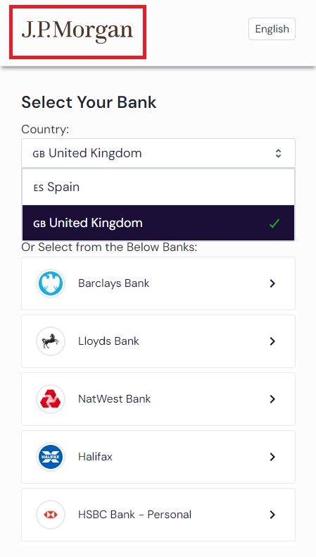
Merchants can upload their logo to customize the HPP. The logo will then be displayed on the top left corner of the HPP (see example).
Font Family
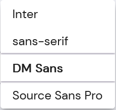
Font family can be configured to customize the HPP. The following values are supported:
UI Text color options
Different color styles can be chosen to customize different elements in the HPP UI.
| Style | Configuration |
|---|---|
| Title | Implement a standardized color scheme for titles using the global font family. 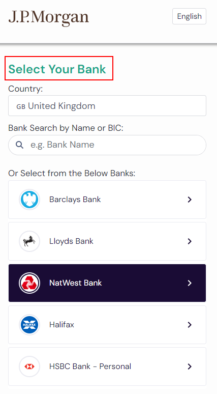 |
| Text | Implement a standard color scheme for special text and links using the global font family. 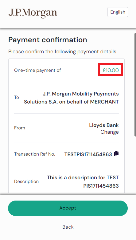 |
| Normal 1 | The color scheme can be set up for default text on the HPP (Hosted payment page).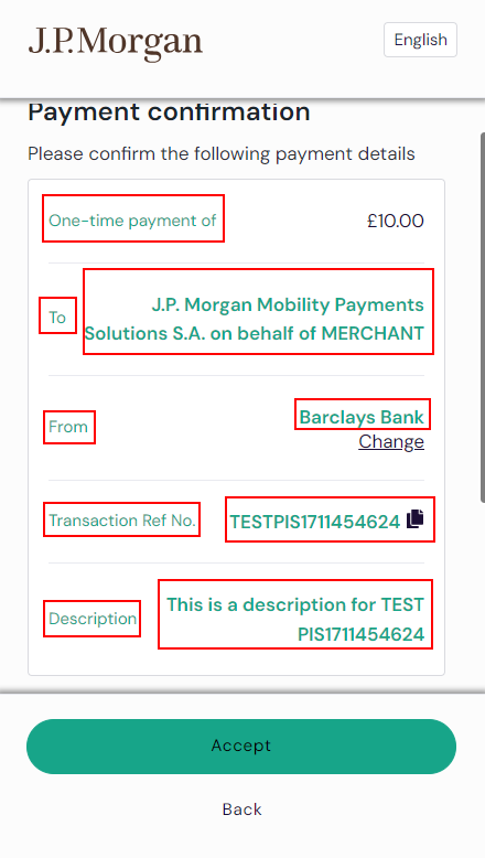 |
| Spinner | The color for the spinners in the HPP can be changed.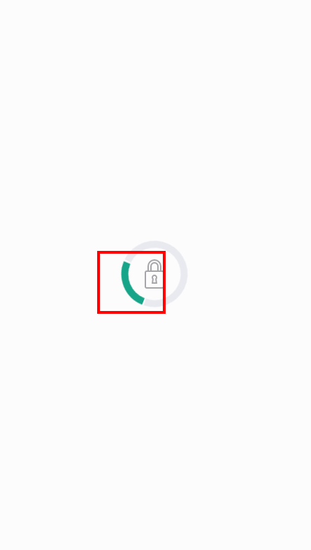 |
| Link | Standard text color scheme for hyperlinks within the HPP.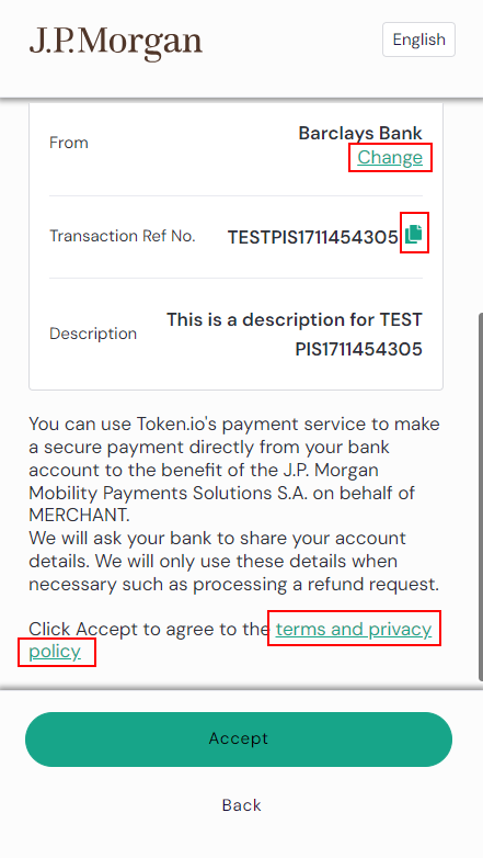 |
| Primary actions | Define a standard color scheme for primary actions, including hover effects on list items and the appearance of the "Back" and "Accept" button.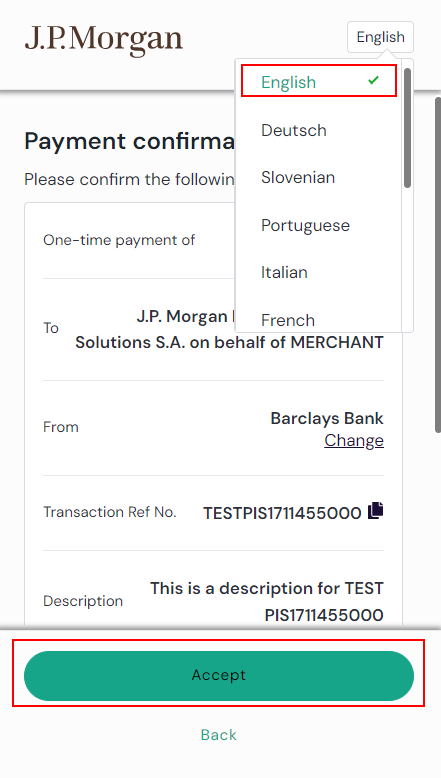 |
| Background color | Background color for lists within the HPP.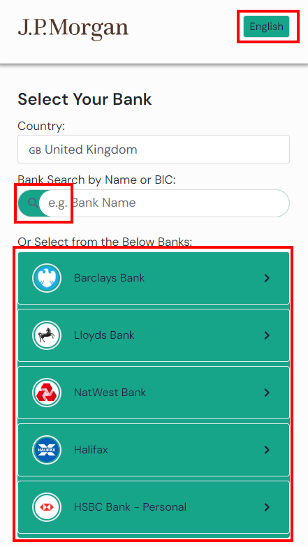 |
| Primary text color | Text color scheme for primary action elements throughout the HPP.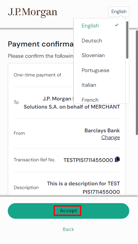 |
| Secondary Actions | Standardized color scheme for secondary action elements including "Back" button.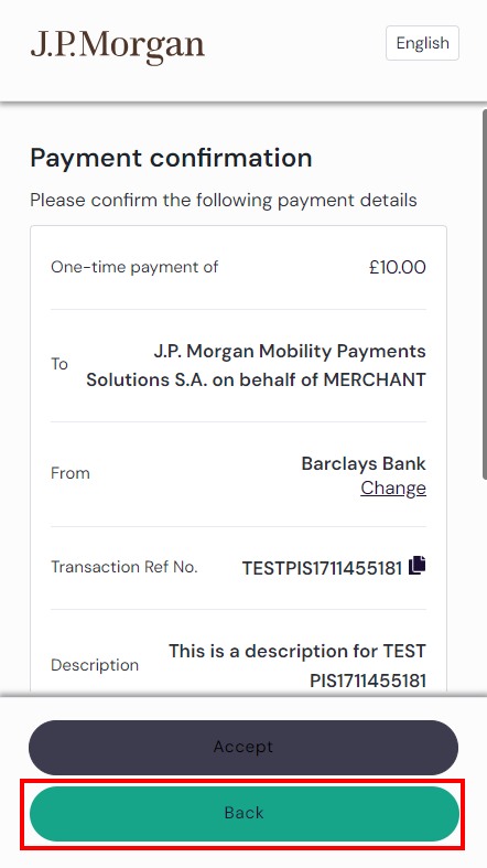 |
| Secondary text color | A text color scheme for secondary text elements, such as labels for secondary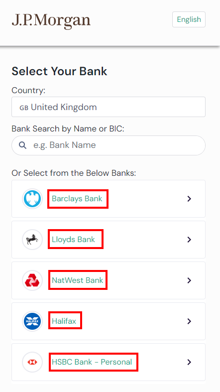 |
| Borders | Configure color of the borders in the HPP.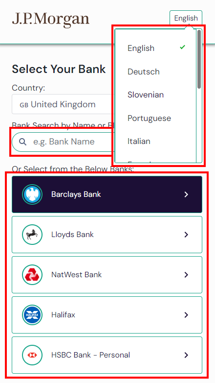 |
| Heading 2 & 3 | Configure the color for sub-title text in the HPP.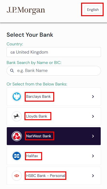 |
| Normal 2 | Set up the color for consent texts.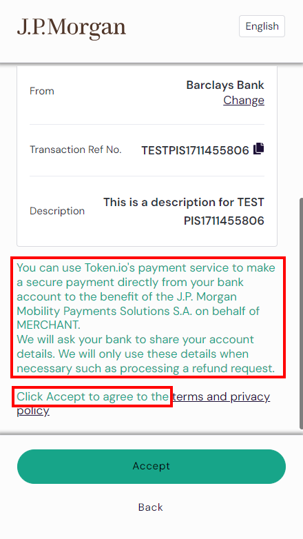 |
| Button Primary Focus | Set up the color background of a primary button in case user focuses on it in the HPP.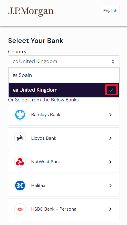 |
| Button Primary Press | Configure the color of background of a primary button in case the user presses it in the HPP. |
| Button Primary Hover | Color of background of a primary button in case the user hovers over it in the HPP. |
| Button Secondary Focus | Set up the color of the background of a secondary button e.g., "Back" button in case the user focuses on it in the HPP.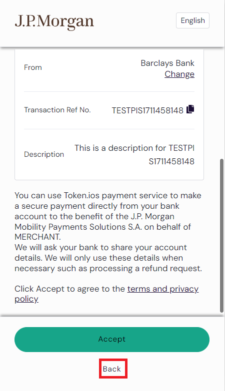 |
| Button Secondary Press | Color scheme of the background of a secondary button in case the user clicks it in the HPP. |
| Button Secondary Hover | Color scheme of the background of a secondary button in case the user hovers over it in the HPP. |
| Button Focus Color Outline | The color of the focus outline color for actionable items in the HPP.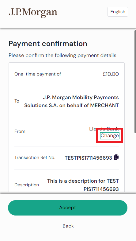 |
Font Weights
It is possible to configure the weight of the fonts for text in the HPP.
| Font weight | Configuration |
|---|---|
| Bold | Standardized font weight configuration for title texts. 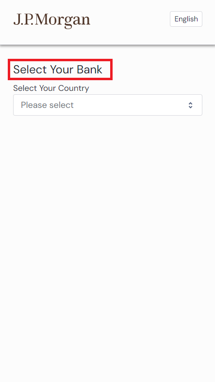 |
| Semi Bold | A standardized font weight configuration for sub-title texts. 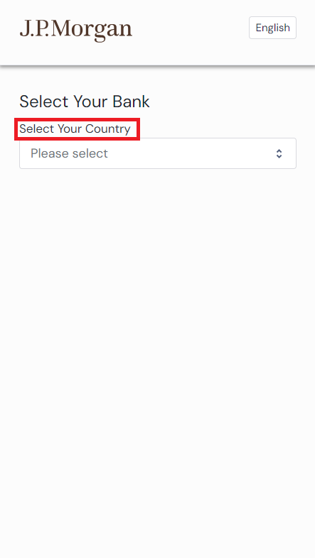 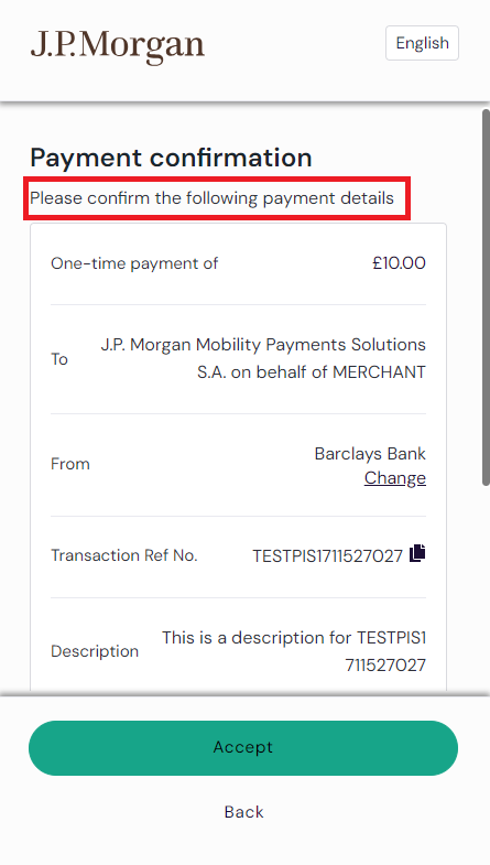 |
| Dark | A standardized font weight configuration for consent details within the HPP. 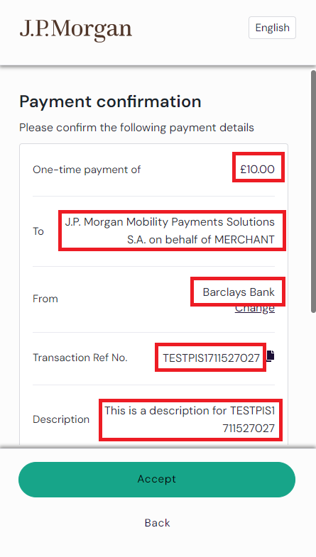 |
| Medium | A standardized font weight configuration for consent data titles in the HPP. 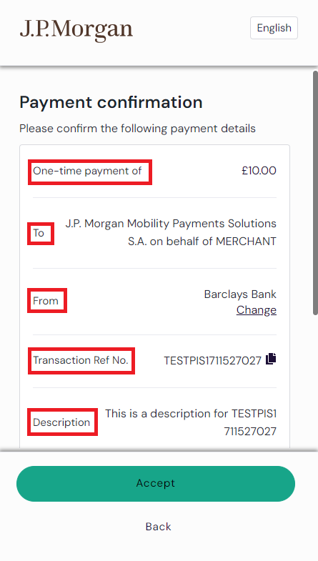 |
| Regular | A standardized font weight configuration used on lists, recent banks text, etc.  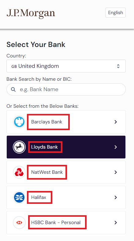 |
| Light | A standardized font weight configuration for consent texts in the HPP. 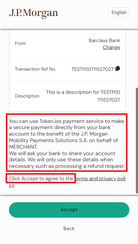 |
Font sizes
It is possible to configure the text size of the fonts in the HPP.
| Font size | Configuration |
|---|---|
| Heading 1 | The size of font used in HPP page titles. 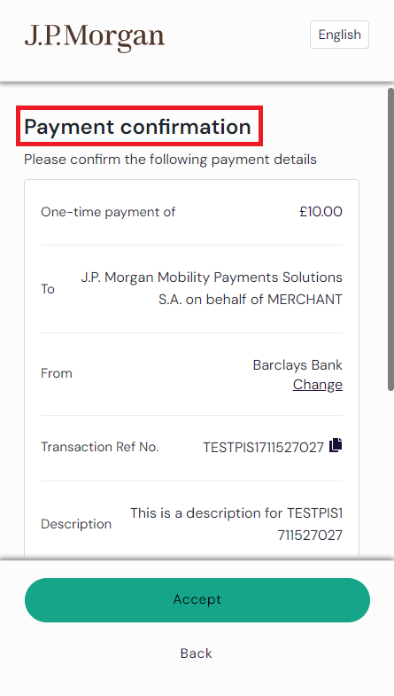 |
| Heading 2 | The size of font that is used in text inputs like IBAN and for selected items from lists. 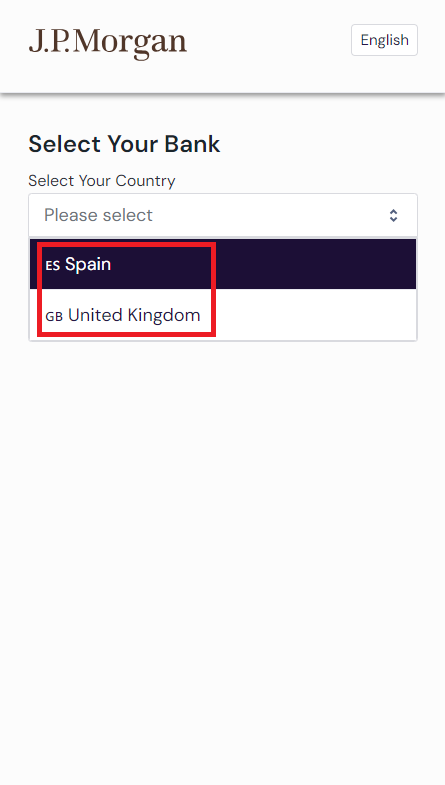 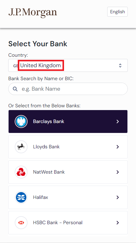 |
| Heading 3 | The size of font that is used is used in sub titles and for consent details. 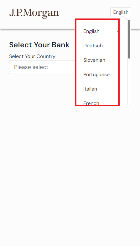 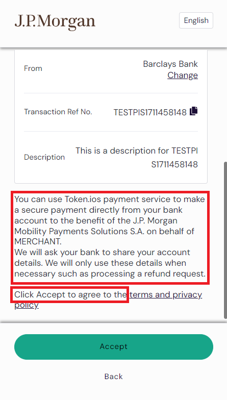 |
| Normal 1 | The size of font that is used in consent-data-titles. 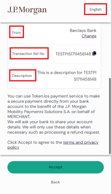 |
| Normal 2 | The font size displayed in consent texts in the HPP. 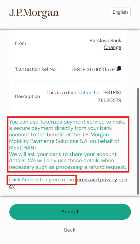 |